Stat-Ease Blog

Categories
Mixture Designs – Gimmick or Magic?
Years ago, I attended Stat-Ease’s Modern DOE workshop in Minneapolis—a five day deep dive into factorial and response surface methods (RSM). I then completed a four day course on Mixture Design for Optimal Formulations. Since then, I’ve trained practitioners and coached users through hundreds of experiments. One pattern is consistent: most people—myself included—gravitate toward familiar factorial or RSM designs and hesitate to use mixture designs for formulation work.
The result is force-fitting RSM tools onto mixture problems. Like using a flathead screwdriver on a Phillips screw, it can work, but it’s rarely ideal. And, avoiding mixture designs can actually create real problems. So, what makes mixtures unique, and what goes wrong when we ignore that?
Why Mixtures Are Different
In mixtures, ratios drive responses, not absolute amounts. The flavor of a cookie depends on the ratio of flour, sugar, fat, and salt; not the grams of sugar alone. And because mixture components must sum to a total (often 100%), choosing levels for some ingredients automatically constrains the rest.
The Ratio Workaround—and Its Limits
A common workaround is to convert a q-component mixture into q-1 ratios and run a standard RSM design¹. For example, suppose we’re formulating a sweetener blend (A = sugar, B = corn syrup, C = honey) that always makes up 10% of a cookie recipe. If we express the system using ratios B:A and C:A, we can build a two factor RSM design with ratio levels like 1:1, 2:1, and 3:1.
But compared to a true three component mixture design, the difference is clear. The ratio based design samples only narrow rays of the mixture space, leaving large regions unexplored. Standard error plots show that a proper mixture design provides far better prediction capability across the full region.
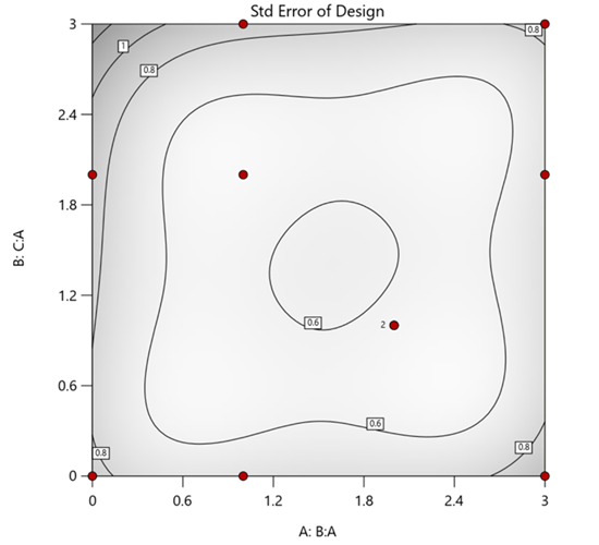
Figure 1. Optimal 10-run RSM design layout using two ratios for a three-component mixture. The shading conveys the relative standard error: lighter is lower, darker is higher.
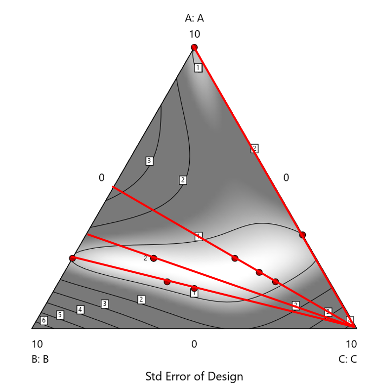
Figure 2. Translation of the ratio design from Figure 1 onto a three-component layout.
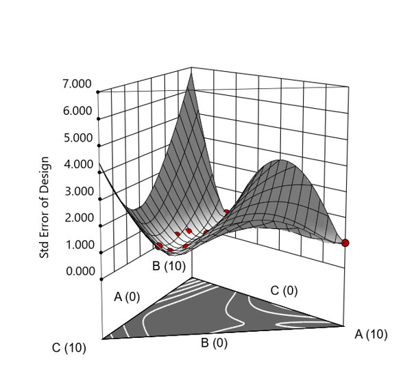
Figure 3. Standard error 3D plot of the 10-run ratio design.
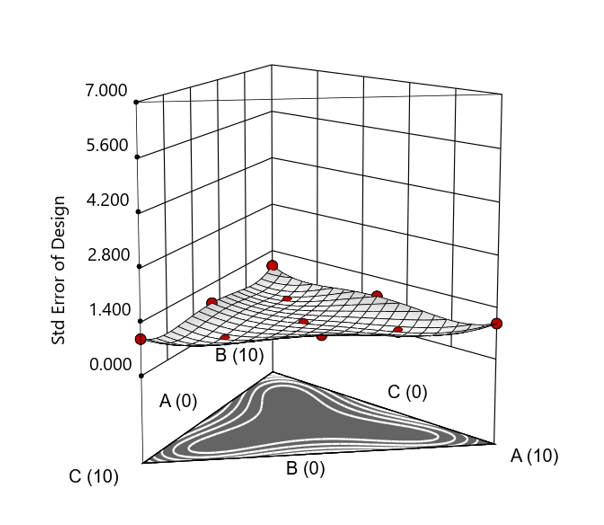
Figure 4. Standard error 3D plot for a 10-run augmented simplex mixture design.
In short: the ratio trick can work, but it never matches the statistical properties of a proper mixture design.
The Slack Component Argument
Another justification for using RSM is when one ingredient is believed to be inconsequential. Perhaps the component is believed to be inert or is simply a diluent that makes up the balance of a formulation. The idea is to treat this component as a slack variable and allow it to fill whatever space remains after setting the other ingredients. One slack approach is to simply use the upper and lower values as levels of the non slack components in a standard RSM. Below is a comparison of a three-component system analyzed as a true mixture design alongside a two-factor RSM that eliminates the diluent as a component.
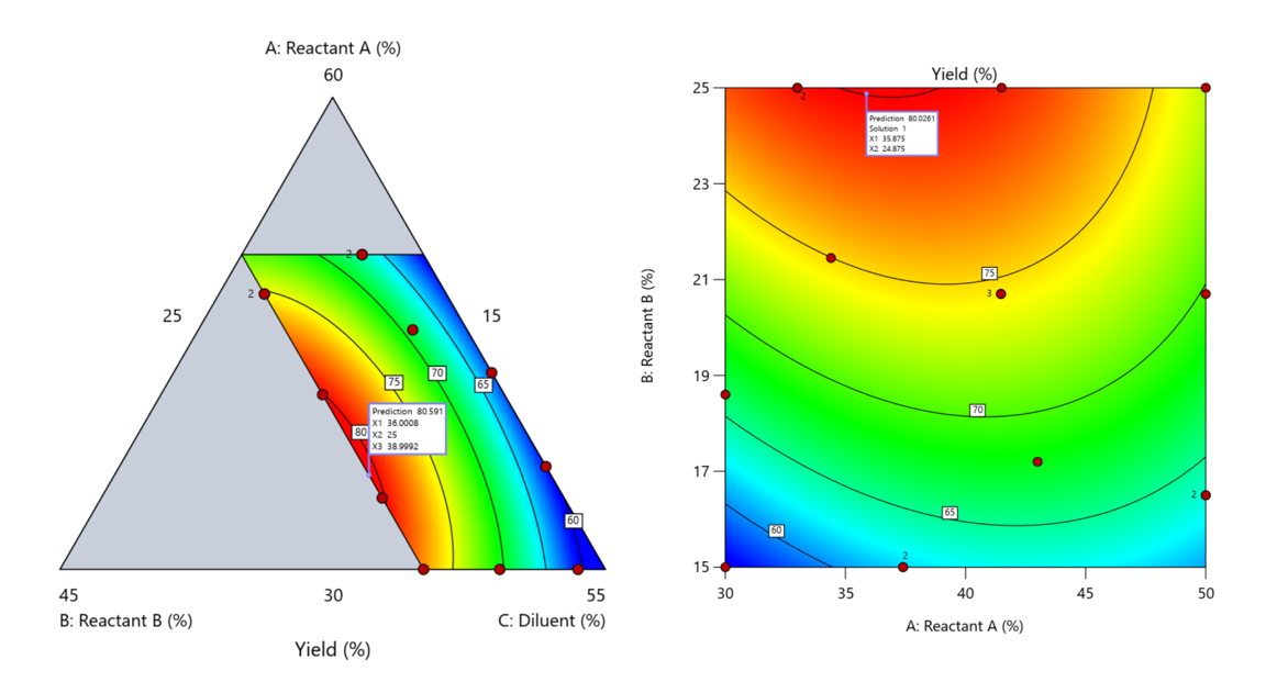
Figure 5. Optimization comparison of a three component mixture design and a two factor (component) RSM approach
In this case, both approaches found essentially the same optimal conditions. Ignoring the diluent really didn’t impact the story, but the RSM approach is not specifically assessing the interactive behavior between the reactants and the diluent. If we study the system as an RSM, we assume the interactions involving the omitted component were not consequential—which may not be true. Cornell² states that the factor effects we are seeing are actually the effects confounded with the opposite effect of the ignored component. Without using a mixture design, we would have no way of validating our assumptions about these interactions.
Cornell³ also describes an alternative slack approach where the slack component is included in the design but excluded from the predictive model. Some practitioners believe this approach makes sense when the diluent interacts weakly with the key ingredients, the omitted component is the one with the widest range of proportionate values, or if that component makes up the bulk of the formulation. But statistically, this presents some interesting complexities.
Using the above chemical reaction example, Figure 6 shows the model differences between the Scheffé approach and the resulting models when each component is considered the slack component.
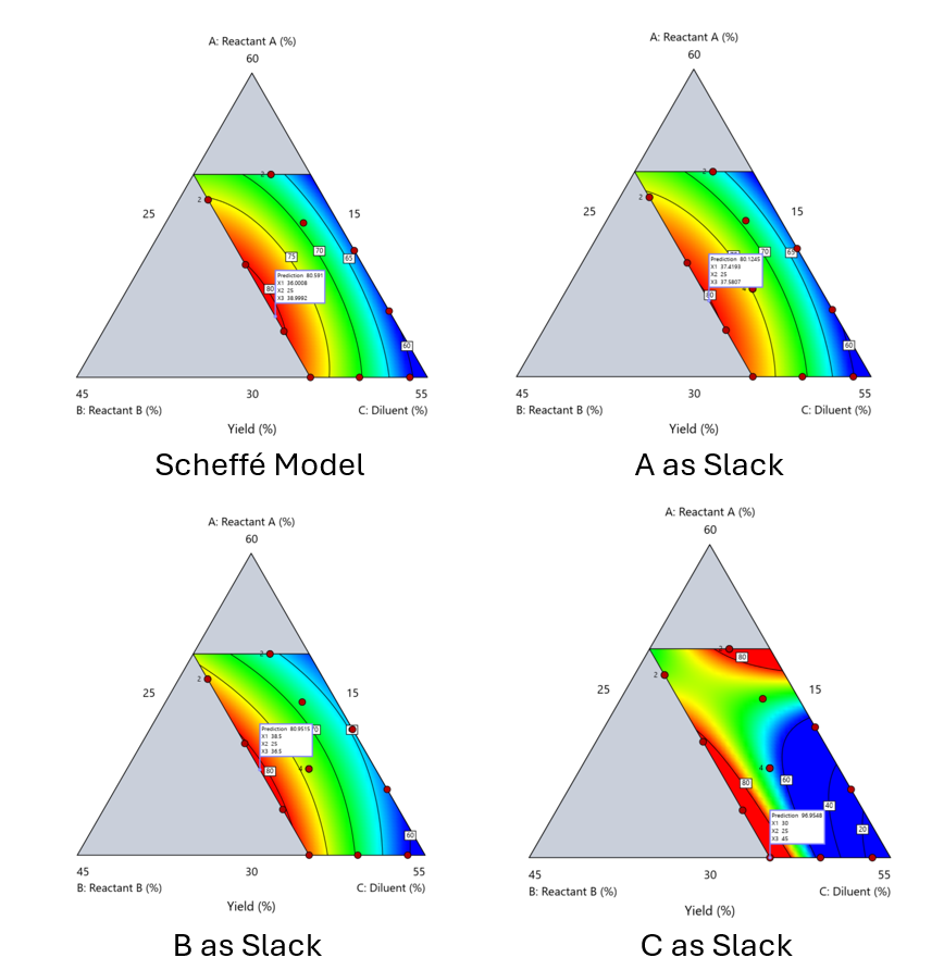
Figure 6. Comparing the Scheffé and Slack modeling techniques.
Note that in this example, while some of the models are similar, the one involving the diluent as the slack variable differs most from the Scheffé standard. Had we assumed the diluent could have been used as the slack variable, we would have poorly modeled and optimized the system.
Because slack variable models exclude at least one component and its interactions, they’re best avoided when possible.
When Components Don’t Share a Scale
Mixture designs require all components to share a common basis (percent, ppm, etc.). This becomes awkward when ingredients span vastly different scales—for example, large amounts of reactants plus a catalyst at ppm levels. The phenomenon is often called the “sliver effect” because the design space becomes a very narrow region for the low-level component, as shown in Figure 7.
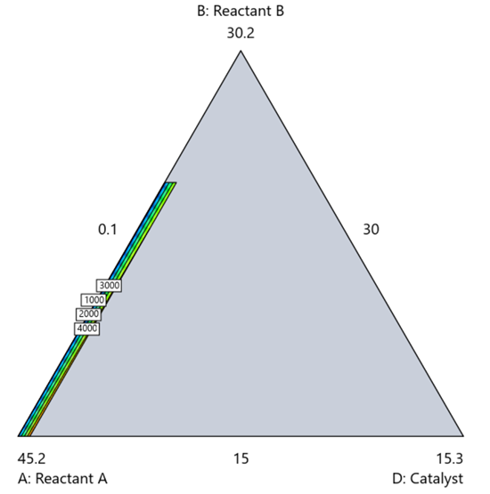
Figure 7. The sliver effect that can occur when one component is present in much lower levels than the balance of the formulation.
One way to avoid a sliver is to change the metric: in this case, changing to molar percent may put the components on a comparable basis and all components could have been included in the mixture design. Or, if I’m still avoiding mixtures, a practical solution is a combined design: treat the main ingredients as a mixture and the catalyst as a process variable. Both the mixture and the catalyst should be modeled quadratically to capture interactions. However, the interactive nature of components is best resolved when all ingredients are included in the mixture design.
The Bottom Line
For formulations, and recipes, the best results come from designs built specifically for mixtures. They’re not gimmicks or magic; they’re the right tools for the job. Stat-Ease provides tutorials and webinars to help you get started:
- A Crash Course in Mixture Design of Experiments
- Optimal experiment designs that combine mixture, process and categorical inputs
Or, if you’d prefer a hands-on, instructor-led experience (maybe with me!), sign up for one of the following courses:
References:
- Response Surface Methodology, 4th edition, Myers, Montgomery, Anderson-Cook, pp. 759-763 (Wiley).
- Experiments with Mixtures, 3rd edition, John Cornell, p. 16 (Wiley).
- Experiments with Mixtures, 3rd edition, John Cornell, p. 333-343 (Wiley).
Like the blog? Never miss a post - sign up for our blog post mailing list.
Mastering mixture modeling
Mixture models (also known as "Scheffé," after the inventor) differ from standard polynomials by their lack of intercept and squared terms. For example, most of us learned about quadratic models in high school and/or college math classes, such as this one for two factors:
These models are extremely useful for optimizing processes via response surface methods (RSM) such as central composite designs (CCDs).
Mixture models look different. For example, consider this non-linear blending model for the melting point (Y) of copper (X₁) and gold (X₂) derived from a statistically designed mixture experiment*:
As you can see, this equation, set up to work with components coded on a 0 to 1 scale, does not include an intercept (ß₀) or squared terms (X₁², X₂²). However, it works quite well for predicting the behavior of a two-component mixture. The first-order coefficients, 1043 and 1072, are quite simple to interpret—these fitted values quantify the measured** melting points in degrees C for copper and gold, respectively. The difference of 29 characterizes the main-component effect (copper 29 degrees higher than gold).
The second-order coefficient of 536 is a bit trickier to interpret. It being negative characterizes the counterintuitive (other than for metallurgists) nonlinear depression of the melting point at a 50/50 composition of the metals. But be careful when quantifying the reduction in the melting: It is far less than you might think. Figure 1 tells the story.
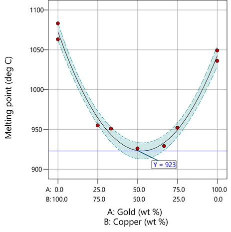
Figure 1: Response surface for melting point of copper versus gold
First off, notice that the left side—100% copper—is higher than the right side—100% gold. This is caused by the main-component effect. Then observe the big dip in the middle created by a significant, second-order impact from non-linear blending. Because of this, the melting point reaches a minimum of 923 degrees C at and just beyond the 50/50 blend point. This falls 134 degrees below the average melting point of 1057 degrees. Given the coefficient of -536 on the X₁X₂ term, you probably expected a much bigger reduction. It turns out 541 divided by 4 equals 134. This is not coincidental—at the 50/50 blend point the product of the coded values reaches a maximum of 0.25 (0.5 x 0.5), and thus the maximum deflection is one-fourth (1/4) of the coefficient.
If your head is spinning at this point, I advise you not to attempt to interpret coefficients of the mixture model beyond the main component effects and, if significant, only the sign of the second-order, non-linear blending term, that is, whether it is positive or negative. Then after validating your model via Stat-Ease software diagnostics, visualize the model performance via our program’s wonderful model graphics—trace plot, 2D contour, and 3D surface. Follow up by doing a numeric optimization to pinpoint an optimum blend that meets all your requirements.
However, if you would like to truly master mixture modeling, come to our next Fundamentals of Mixture DOE workshop.
* For the raw data, see Table 1-1 of A Primer on Mixture Design: What’s in it for Formulators. Due to a more precise fitting, the model coefficients shown in this blog differ slightly from those presented in the Primer.
** Keep in mind these are results from an experiment and thus subject to the accuracy and precision of the testing and the purity of the metals—the theoretical melting points for pure gold and copper are 1064 and 1085 degrees C, respectively.
Like the blog? Never miss a post - sign up for our blog post mailing list.
Tips and tricks for designing statistically optimal experiments
Like the blog? Never miss a post - sign up for our blog post mailing list.
A fellow chemical engineer recently asked our StatHelp team about setting up a response surface method (RSM) process optimization aimed at establishing the boundaries of his system and finding the peak of performance. He had been going with the Stat-Ease software default of I-optimality for custom RSM designs. However, it seemed to him that this optimality “focuses more on the extremes” than modified distance or distance.
My short answer, published in our September-October 2025 DOE FAQ Alert, is that I do not completely agree that I-optimality tends to be too extreme. It actually does a lot better at putting points in the interior than D-optimality as shown in Figure 2 of "Practical Aspects for Designing Statistically Optimal Experiments." For that reason, Stat-Ease software defaults to I-optimal design for optimization and D-optimal for screening (process factorials or extreme-vertices mixture).
I also advised this engineer to keep in mind that, if users go along with the I-optimality recommended for custom RSM designs and keep the 5 lack-of-fit points added by default using a distance-based algorithm, they achieve an outstanding combination of ideally located model points plus other points that fill in the gaps.
For a more comprehensive answer, I will now illustrate via a simple two-factor case how the choice of optimality parameters in Stat-Ease software affects the layout of design points. I will finish up with a tip for creating custom RSM designs that may be more practical than ones created by the software strictly based on optimality.
An illustrative case
To explore options for optimal design, I rebuilt the two-factor multilinearly constrained “Reactive Extrusion” data provided via Stat-Ease program Help to accompany the software’s Optimal Design tutorial via three options for the criteria: I vs D vs modified distance. (Stat-Ease software offers other options, but these three provided a good array to address the user’s question.)
For my first round of designs, I specified coordinate exchange for point selection aimed at fitting a quadratic model. (The default option tries both coordinate and point exchange. Coordinate exchange usually wins out, but not always due to the random seed in the selection algorithm. I did not want to take that chance.)
As shown in Figure 1, I added 3 additional model points for increased precision and kept the default numbers of 5 each for the lack-of-fit and replicate points.
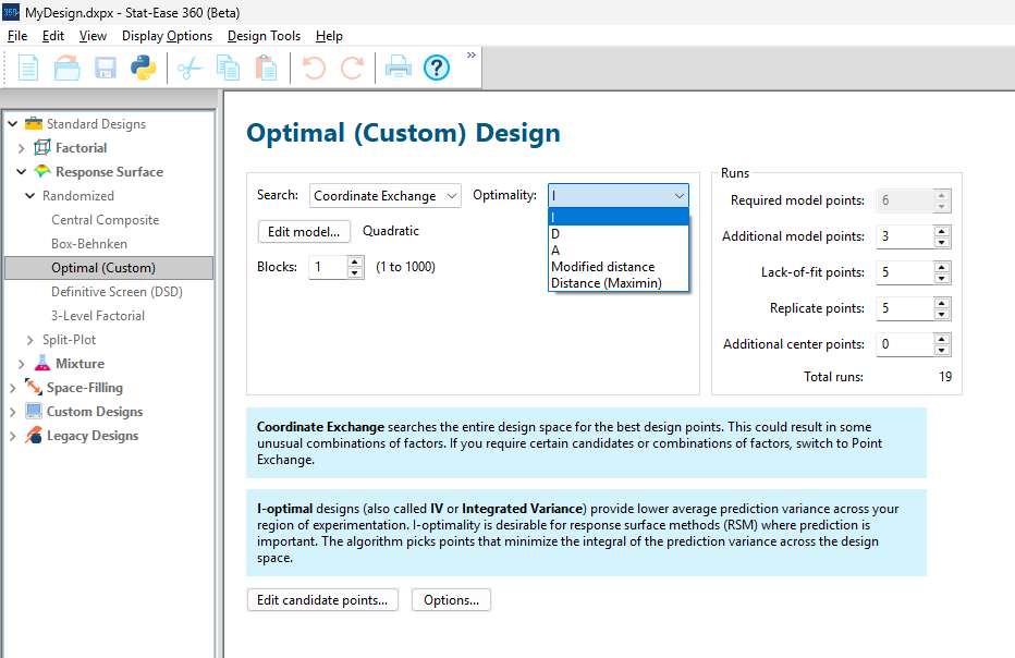
Figure 1: Set up for three alternative designs—I (default) versus D versus modified distance
As seen in Figure 2’s contour graphs produced by Stat-Ease software’s design evaluation tools for assessing standard error throughout the experimental region, the differences in point location are trivial for only two factors. (Replicated points display the number 2 next to their location.)
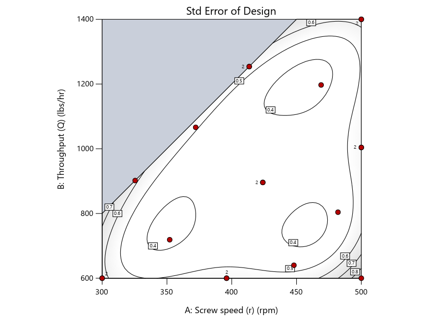
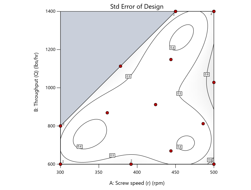
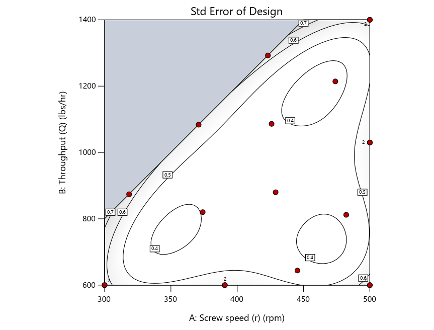
Figure 2: Designs built by I vs D vs modified distance including 5 lack-of-fit points (left to right)
Keeping in mind that, due to the random seed in our algorithm, run-settings vary when rebuilding designs, I removed the lack-of-fit points (and replicates) to create the graphs in Figure 2.
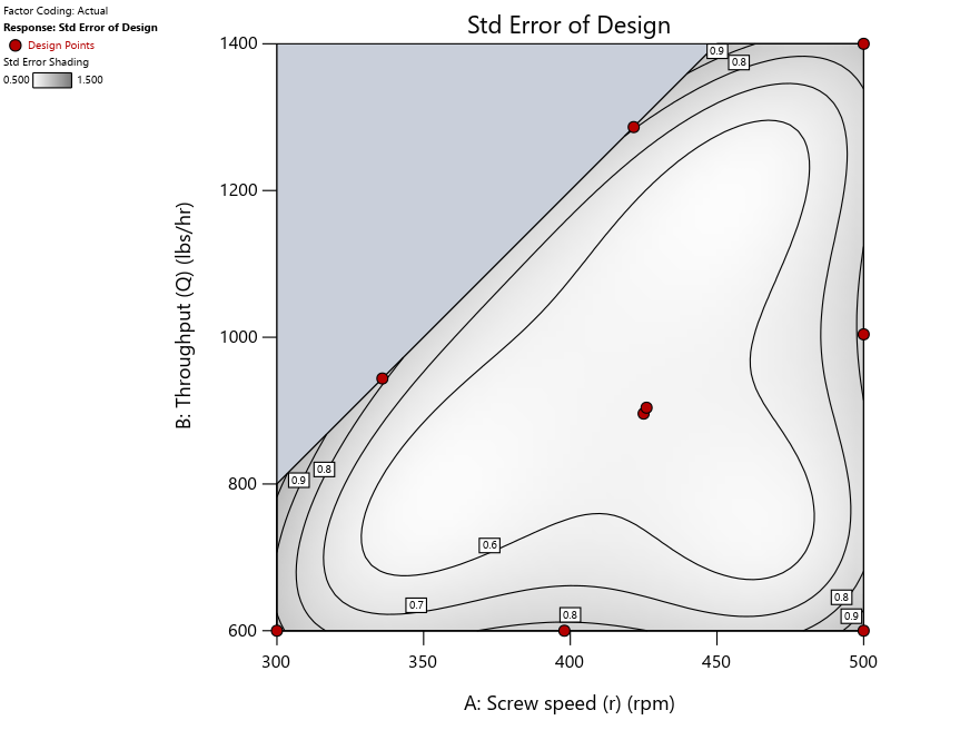

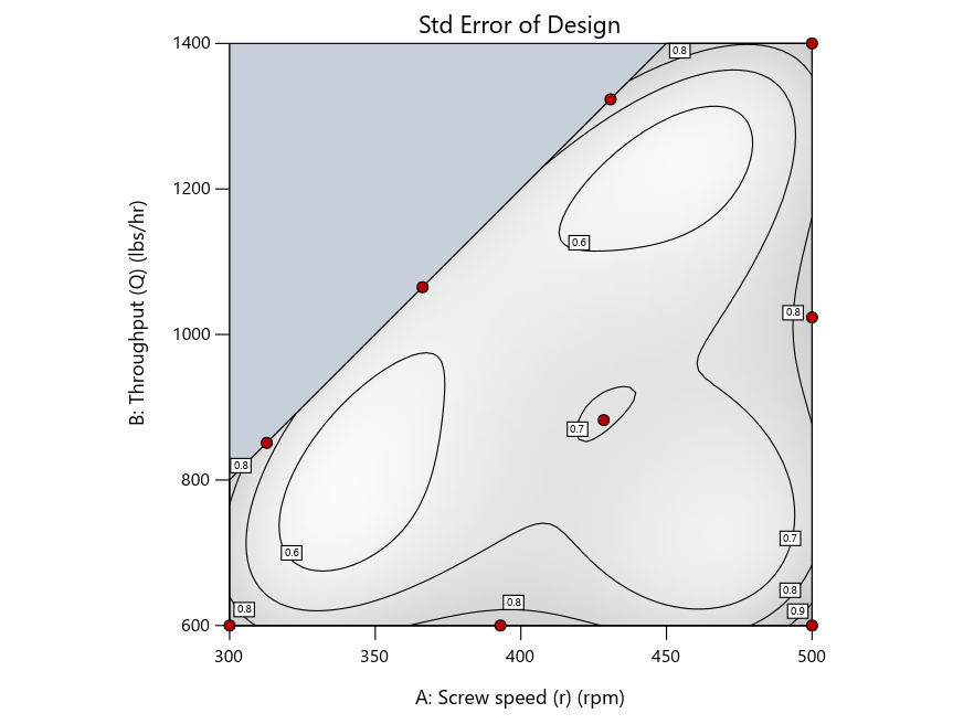
Figure 3: Designs built by I vs D vs modified distance excluding lack-of-fit points (left to right)
Now you can see that D-optimal designs put points around the outside, whereas I-optimal designs put points in the interior, and the space-filling criterion spreads the points around. Due to the lack of points in the interior, the D-optimal design in this scenario features a big increase in standard error as seen by the darker shading—a very helpful graphical feature in Stat-Ease software. It is the loser as a criterion for a custom RSM design. The I-optimal wins by providing the lowest standard error throughout the interior as indicated by the light shading. Modified distance base selection comes close to I optimal but comes up a bit short—I award it second place, but it would not bother me if a user liking a better spread of their design points make it their choice.
In conclusion, as I advised in my DOE FAQ Alert, to keep things simple, accept the Stat-Ease software custom-design defaults of I optimality with 5 lack-of-fit points included and 5 replicate points. If you need more precision, add extra model points. If the default design is too big, cut back to 3 lack-of-fit points included and 3 replicate points. When in a desperate situation requiring an absolute minimum of runs, zero out the optional points and ignore the warning that Stat-Ease software pops up (a practice that I do not generally recommend!).
A practical tip for point selection
Look closely at the I-optimal design created by coordinate exchange in Figure 3 on the left and notice that two points are placed in nearly the same location (you may need a magnifying glass to see the offset!). To avoid nonsensical run specifications like this, I prefer to force the exchange algorithm to point selection. This restricts design points to a geometrically registered candidate set, that is, the points cannot move freely to any location in the experimental region as allowed by coordinate exchange.
Figure 4 shows the location of runs for the reactive-extrusion experiment with point selection specified.
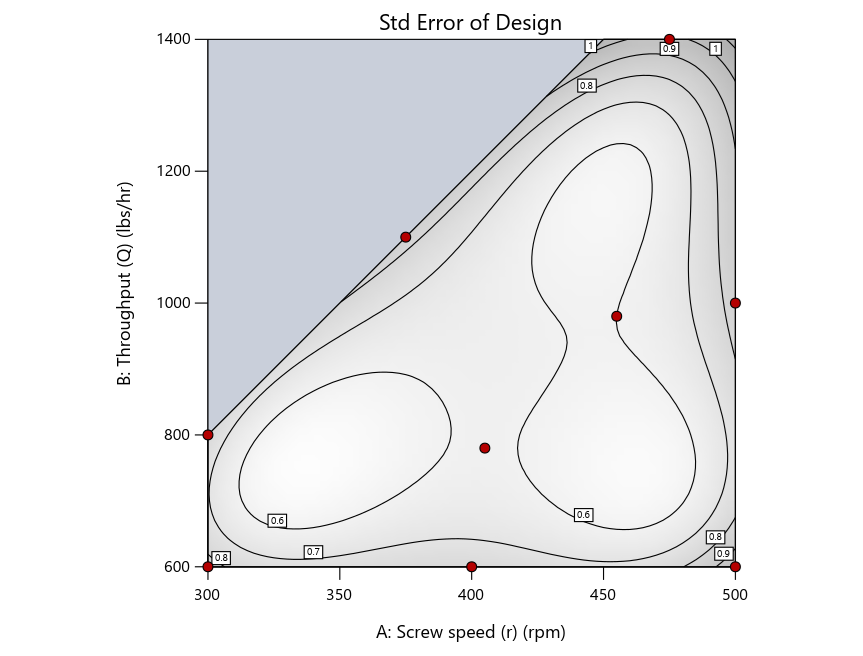
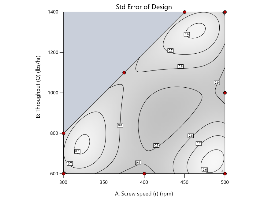
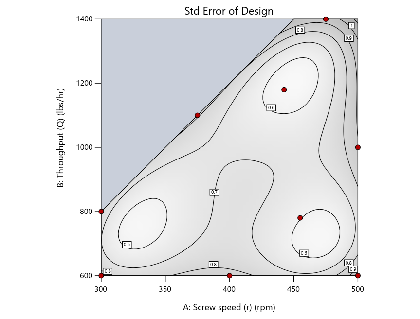
Figure 4: Designs built by I vs D vs modified distance by point exchange (left to right)
The D optimal remains a bad choice—the same as before. The edge for I optimal over modified distance narrows due to point exchange not performing quite as well for as coordinate exchange.
As an engineer with a wealth of experience doing process development, I like the point exchange because it:
- Reaches out for the ‘corners’—the vertices in the design space,
- Restricts runs to specific locations, and
- Allows users to see where they are by showing space point type on the design layout enabled via a right-click over the upper left corner.
Figures 5a and 5b illustrate this advantage of point over coordinate exchange.
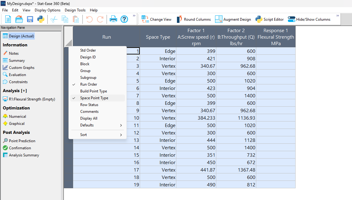
Figure 5a: Design built by coordinate exchange with Space Point Type toggled on
On the table displayed in Figure 5a for a design built by coordinate exchange, notice how points are identified as “Vertex” (good the software recognized this!), “Edge” (not very specific) and “Interior” (only somewhat helpful).
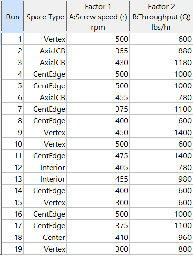
Figure 5b: Design built by point exchange with Space Point Type shown
As shown by Figure 5b, rebuilding the design via point exchange produces more meaningful identification of locations (and better registered geometrically): “Vertex” (a corner), “CentEdge” (center of edge—a good place to make a run), “Center” (another logical selection) and “Interior” (best bring up the contour graph via design evaluation to work out where these are located—click any point to identify them by run number).
Full disclosure: There is a downside to point exchange—as the number of factors increases beyond 12, the candidate set becomes excessive and thus the build takes more time than you may be willing to accept. Therefore, Stat-Ease software recommends going only with the far faster coordinate exchange. If you override this suggestion and persist with point exchange, no worries—during the build you can cancel it and switch to coordinate exchange.
Final words
A fellow chemical engineer often chastised me by saying “Mark, you are overthinking things again.” Sorry about that. If you prefer to keep things simple (and keep statisticians happy!), go with the Stat-Ease software defaults for optimal designs. Allow it to run both exchanges and choose the most optimal one, even though this will likely be the coordinate exchange. Then use the handy Round Columns tool (seen atop Figure 5a) to reduce the number of decimal places on impossibly precise settings.
Like the blog? Never miss a post - sign up for our blog post mailing list.
August Publication Roundup
Here's the latest Publication Roundup! In these monthly posts, we'll feature recent papers that cited Design-Expert® or Stat-Ease® 360 software. Please submit your paper to us if you haven't seen it featured yet!
Featured Article
Design and optimization of imageable microspheres for locoregional cancer therapy
Scientific Reports volume 15, Article number: 27487 (2025)
Authors: Brenna Kettlewell, Andrea Armstrong, Kirill Levin, Riad Salem, Edward Kim, Robert J. Lewandowski, Alexander Loizides, Robert J. Abraham, Daniel Boyd
Mark's comments: This is a great application of mixture design for optimal formulation of a medical-grade glass. The researchers used Stat-Ease software tools to improve the properties of microspheres to an extent that their use can be extended to cancers beyond the current application to those located in the liver. Well done!
Be sure to check out this important study, and the other research listed below!
More new publications from August
- Use of experimental design for screening and optimization of variables influencing photocatalytic degradation of pollutants in aqueous media: A review of chemometrics tools
Chemical Engineering Research and Design, Volume 220, August 2025, Pages 270-291
Authors: Pedro César Quero–Jiménez, Aracely Hernández–Ramírez, Jorge Luis Guzmán–Mar, Jorge Basilio de la Torre–López, Matheus Silva–Gigante, Laura Hinojosa–Reyes - Analytical Quality by Design-Based Stability-Indicating UHPLC Method for Determination of Inavolisib in Bulk and Formulation
Separation Science Plus, no. 8 (2025): 8, e70110
Authors: Ashwinkumar Matta, Raja Sundararajan - Enhanced anti-infective activities of sinapic acid through nebulization of lyophilized protransferosomes
Frontiers in Nanotechnology | Biomedical Nanotechnology, Volume 7 - 2025
Authors: Hani A. Alhadrami, Amr Gamal, Ngozi Amaeze, Ahmed M. Sayed, Mostafa E. Rateb, and Demiana M. Naguib - Optimizing Anti-Corrosive Properties of Polyester Powder Coatings Through Montmorillonite-Based Nanoclay Additive and Film Thickness
Corrosion and Materials Degradation, 2025, 6(3), 39
Authors: Marshall Shuai Yang, Chengqian Xian, Jian Chen, Yolanda Susanne Hedberg, James Joseph Noël - Regulatory mechanism and multi-index coordinated optimization of pipeline transportation performance of coarse-grained gangue slurry: Experimental and simulation investigation
Physics of Fluids 37, 073343 (2025)
Authors: Jianfei Xu (许健飞); Jixiong Zhang (张吉雄); Nan Zhou (周楠); Hao Yan (闫浩); Wenfu Zhou (周文福); Qian Chen (陈乾); Jiarun Chen (陈嘉润) - Optimization of clayey soil parameters with aeolian sand through response surface methodology and a desirability function
Scientific Reports volume 15, Article number: 30831 (2025)
Authors: Ghania Boukhatem, Messaouda Bencheikh, Mohammed Benzerara, Mehmet Serkan Kırgız, N. Nagaprasad, Krishnaraj Ramaswamy, Souhila Rehab-Bekkouche, R. Shanmugam - Development of electromagnetic drop weight release mechanism for human occupied vehicle
Scientific Reports volume 15, Article number: 30663 (2025)
Authors: Sathia Narayanan Dharmaraj, Karthikeyan Shanmugam, Jothi Chithiravel, Ramesh Sethuraman - Operating parameter optimization and experiment of spiral outer grooved wheel seed metering device based on discrete element method
Scientific Reports volume 15, Article number: 30762 (2025)
Authors: Tao Zhang, Xinglong Tang, Cong Dai, Guiying Ren - Parameter optimization of key components in seed-metering device for pre-cut seed stems of Pennisetum hydridum
Scientific Reports volume 15, Article number: 31318 (2025)
Authors: Chong Liu, Xiongfei Chen, Qiang Xiong, Muhua Liu, Junan Liu, Jiajia Yu, Peng Fang, Yihan Zhou, Chuanhong Zhan, Yao Xiao - Optimization of new and thermally aged natural monoesters blends for a sustainable management of power transformers
Industrial Crops and Products, Volume 235, 1 November 2025, 121741
Authors: Gerard Ombick Boyekong, Gabriel Ekemb, Emeric Tchamdjio Nkouetcha, Ghislain Mengata Mengounou, Adolphe Moukengue Imano
Perfecting pound cake via mixture design for optimal formulation
Thanksgiving is fast approaching—time to begin the meal planning. With this in mind, the NBC Today show’s October 22nd tips for "75 Thanksgiving desserts for the sweetest end to your feast" caught my eye, in particular the Donut Loaf pound cake. My 11 grandkids would love this “giant powdered sugar donut” (and their Poppa, too!).
I became a big fan of pound cake in the early 1990s while teaching DOE to food scientists at Sara Lee Corporation. Their ready-made pound cakes really hit the spot. However, it is hard to beat starting from scratch and baking your own pound cake. The recipe goes backs hundreds of years to a time when many people could not read, thus it simply called for a pound each of flour, butter, sugar and eggs. Not having a strong interest in baking and wanting to minimize ingredients and complexity (other than adding milk for moisture and baking powder for tenderness), I made this formulation my starting point for a mixture DOE, using the Sara Lee classic pound cake as the standard for comparison.
As I always advise Stat-Ease clients, before designing an experiment, begin with the first principles. I took advantage of my work with Sara Lee to gain insights on the food science of pound cake. Then I checked out Rose Levy Beranbaum’s The Cake Bible from my local library. I was a bit dismayed to learn from this research that the experts recommended cake flour, which costs about four times more than the all-purpose (AP) variety. Having worked in a flour mill during my time at General Mills as a process engineer, I was skeptical. Therefore, I developed a way to ‘have my cake and eat it too’: via a multicomponent constraint (MCC), my experiment design incorporated both varieties of flour. Figure 1 shows how to enter this in Stat-Ease software.

Figure 1. Setting up the pound cake experiment with a multicomponent constraint on the flours
By the way, as you can see in the screen shot, I scaled back the total weight of each experimental cake to 1 pound (16 ounces by weight), keeping each of the four ingredients in a specified range with the MCC preventing the combined amount of flour from going out of bounds.
The trace plot shown in Figure 2 provides the ingredient directions for a pound cake that pleases kids (based on tastes of my young family of 5 at the time) are straight-forward: more sugar, less eggs and go with the cheap AP flour (its track not appreciably different than the cake flour.)

Figure 2. Trace plot for pound cake experiment
For all the details on my pound cake experiment, refer to "Mixing it up with Computer-Aided Design"—the manuscript for a publication by Today's Chemist at Work in their November 1997 issue. This DOE is also featured in “MCCs Made as Easy as Making a Pound Cake” in Chapter 6 of Formulation Simplified: Finding the Sweet Spot through Design and Analysis of Experiments with Mixtures.
The only thing I would do different nowadays is pour a lot of powdered sugar over the top a la the Today show recipe. One thing that I will not do, despite it being so popular during the Halloween/Thanksgiving season, is add pumpkin spice. But go ahead if you like—do your own thing while experimenting on pound cake for your family’s feast. Happy holidays! Enjoy!
To learn more about MCCs and master DOE for food, chemical, pharmaceutical, cosmetic or any other recipe improvement projects, enroll in a Stat-Ease “Mixture Design for Optimal Formulations” public workshop or arrange for a private presentation to your R&D team.