Stat-Ease Blog

Categories
Know the SCOR for a winning strategy of experiments
Observing process improvement teams at Imperial Chemical Industries in the late 1940s George Box, the prime mover for response surface methods (RSM), realized that as a practical matter, statistical plans for experimentation must be very flexible and allow for a series of iterations. Box and other industrial statisticians continued to hone the strategy of experimentation to the point where it became standard practice for stats-savvy industrial researchers.
Via their Management and Technology Center (sadly, now defunct), Du Pont then trained legions of engineers, scientists, and quality professionals on a “Strategy of Experimentation” called “SCO” for its sequence of screening, characterization and optimization. This now-proven SCO strategy of experimentation, illustrated in the flow chart below, begins with fractional two-level designs to screen for previous unknown factors. During this initial phase, experimenters seek to discover the vital few factors that create statistically significant effects of practical importance for the goal of process improvement.

The ideal DOE for screening resolves main effects free of any two-factor interactions (2FI’s) in broad and shallow two-level factorial design. I recommend the “resolution IV” choices color-coded yellow on our “Regular Two-Level” builder (shown below). To get a handy (pun intended) primer on resolution, watch at least the first part of this Institute of Quality and Reliability YouTube video on Fractional Factorial Designs, Confounding and Resolution Codes.
If you would like to screen more than 8 factors, choose one of our unique “Min-Run Screen” designs. However, I advise you accept the program default to add 2 runs and make the experiment less susceptible to botched runs.

Stat-Ease® 360 and Design-Expert® software conveniently color-code and label different designs.
After throwing the trivial many factors off to the side (preferably by holding them fixed or blocking them out), the experimental program enters the characterization phase (the “C”) where interactions become evident. This requires a higher-resolution of V or better (green Regular Two-Level or Min-Run Characterization), or possibly full (white) two-level factorial designs. Also, add center points at this stage so curvature can be detected.
If you encounter significant curvature (per the very informative test provided in our software), use our design tools to augment your factorial design into a central composite for response surface methods (RSM). You then enter the optimization phase (the “O”).
However, if curvature is of no concern, skip to ruggedness (the “R” that finalizes the “SCOR”) and, hopefully, confirm with a low resolution (red) two-level design or a Plackett-Burman design (found under “Miscellaneous” in the “Factorial” section). Ideally you then find that your improved process can withstand field conditions. If not, then you will need to go back up to the beginning for a do-over.
The SCOR strategy, with some modification due to the nature of mixture DOE, works equally well for developing product formulations as it does for process improvement. For background, see my October 2022 blog on Strategy of Experiments for Formulations: Try Screening First!
Stat-Ease provides all the tools and training needed to deploy the SCOR strategy of experiments. For more details, watch my January webinar on YouTube. Then to master it, attend our Modern DOE for Process Optimization workshop.
Know the SCOR for a winning strategy of experiments!
New Software Features! What's in it for You?
There are a couple features in the latest release of Design-Expert and Stat-Ease 360 software programs (version 22.0) that I really love, and wanted to draw your attention to. These features are accessible to everyone, no matter if you are a novice or an expert in design of experiments.
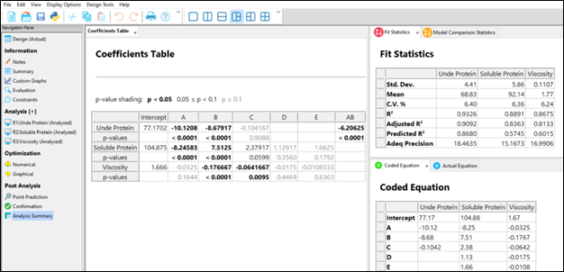
First, the Analysis Summary in the Post Analysis section: This provides a quick view of all response analyses in a set of tables, making it easy to compare model terms, statistics such as R-squared values, equations and more. We are pleased to now have this feature that has been requested many times! When you have a large number of responses, understanding the similarities and differences between the model may lead to additional insights to your product or process.
Second, the Custom Graphs (previously Graph Columns): Functionality and flexibility have been greatly expanded so that you can now plot analysis or diagnostic values, as well as design column information. Customize the colors, shapes and sizes of the points to tell your story in the way that makes sense to your audience.
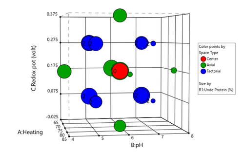
Figure 1 (left) shows the layout of points in a central composite design, where the points are colored by the their space point type (factorial, axial or center points) and then sized by the response value. We can visualize where in the design space the responses are smaller versus larger.
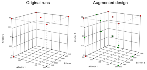
In Figure 2 (right), I had a set of existing runs that I wanted to visualize in the design space. Then I augmented the design with new runs. I set the Color By option to Block to clearly see the new (green) runs that were added to the design space.
These new features offer many new ways to visualize your design, response data, and other pieces of the analysis. What stories will you tell?
Strategy of Experiments for Formulations: Try Screening First!
Consider Screening Down Components to a Vital Few Before Studying Them In-Depth
At the outset of my chemical engineering career, I spent 2 years working with various R&D groups for a petroleum company in Southern California. One of my rotations brought me to their tertiary oil-recovery lab, which featured a wall of shelves filled to the brim with hundreds of surfactants. It amazed me how the chemist would seemingly know just the right combination of anionic, nonionic, cationic and amphoteric varieties to blend for the desired performance. I often wondered, though, whether empirical screening might have paid off by revealing a few surprisingly better ingredients. Then after settling in on the vital few components doing an in-depth experiment may very well have led to discovery of previously unknown synergisms. However, this was before the advent of personal computers and software for mixture design of experiments (DOE), and, thus, extremely daunting for non-statisticians.
Nowadays I help many formulators make the most from mixture DOE via Stat-Ease softwares’ easy-to-use statistical tools. I was very encouraged to see this 2021 meta-analysis that found 200 or so recent publications (2016-2020) demonstrating the successful application of mixture DOE for food, beverage and pharmaceutical formulation development. I believe that this number can be multiplied many-fold to extrapolate these findings to other process industries—chemicals, coatings, cosmetics, plastics, and so forth. Also, keep in mind that most successes never get published—kept confidential until patented.
However, though I am very heartened by the widespread adoption of mixture DOE, screening remains underutilized based on my experience and a very meager yield of publications from 2016 to present from a Google-Scholar search. I believe the main reasons to be:
- Formulators prefer to rely on their profound knowledge of the chemistry for selection of ingredients (refer to my story about surfactants for tertiary oil recovery)
- The number of possibilities get overwhelming; for example, this 2016 Nature publication reports that experimenters on a pear cell suspension culture got thrown off by the 65 blends they believed were required for simplex screening of 20 components (too bad, as shown in the Stat-Ease software screenshot below, by cutting out the optional check blends and constraint-plane-centroids, this could be cut back to substantially.)

- Misapplying factorial screening to mixtures, which, unfortunately happens a lot due to these process-focused experiments being simpler and more commonly used. This is really a shame as pointed out in this Stat-Ease blog post
I feel sure that it pays to screen down many components to a vital few before doing an in-depth optimization study. Stat-Ease software provides some great options for doing so. Give screening a try!!
For more details on mixture screening designs and a solid strategy of experiments for optimizing formulations, see my webinar on Strategy of Experiments for Optimal Formulation. If you would like to speak with our team about putting mixture DOE to good use for your R&D, please contact us.
Wrap-Up: Thanks for a great 2022 Online DOE Summit!
Thank you to our presenters and all the attendees who showed up to our 2022 Online DOE Summit! We're proud to host this annual, premier DOE conference to help connect practitioners of design of experiments and spread best practices & tips throughout the global research community. Nearly 300 scientists from around the world were able to make it to the live sessions, and many more will be able to view the recordings on the Stat-Ease YouTube channel in the coming months.
Due to a scheduling conflict, we had to move Martin Bezener's talk on "The Latest and Greatest in Design-Expert and Stat-Ease 360." This presentation will provide a briefing on the major innovations now available with our advanced software product, Stat-Ease 360, and a bit of what's in store for the future. Attend the whole talk to be entered into a drawing for a free copy of the book DOE Simplified: Practical Tools for Effective Experimentation, 3rd Edition. New date and time: Wednesday, October 12, 2022 at 10 am US Central time.
Even if you registered for the Summit already, you'll need to register for the new time on October 12. Click this link to head to the registration page. If you are not able to attend the live session, go to the Stat-Ease YouTube channel for the recording.

Want to be notified about our upcoming live webinars throughout the year, or about other educational opportunities? Think you'll be ready to speak on your own DOE experiences next year? Sign up for our mailing list! We send emails every month to let you know what's happening at Stat-Ease. If you just want the highlights, sign up for the DOE FAQ Alert to receive a newsletter from Engineering Consultant Mark Anderson every other month.
Thank you again for helping to make the 2022 Online DOE Summit a huge success, and we'll see you again in 2023!
Randomization Done Right
Randomization is essential for success with planned experimentation (DOE) to protect factor effects against bias by lurking variables. For example, consider the 8-run, two-level factorial design shown in Table 1. It lays out the low (−) and high (+) coded levels of each factor in standard, not random, order. Notice that factor C changes level only once throughout the experiment—first being set at the low (minus) level for four runs, followed by the remaining four runs set at the high (plus) level. Now, let’s say that the humidity in the room increases throughout the day—affecting the measured response. Since the DOE runs are not randomized, the change in humidity biases the calculated effect of the non-randomized factor C. Therefore, the effect of factor C includes the humidity change – it is no longer purely due to the change from low to high. This will cause analysis problems!
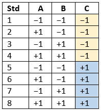
Table 1: Standard order of 8-run design
Randomization itself presents some problems. For example, one possible random order is the classic standard layout, which, as you now know, does not protect against time-related effects. If this unlikely pattern, or other non-desirable patterns are seen, then you should re-randomize the runs to reduce the possibility of bias from lurking variables.
Randomizing center points or other replicates
Replicates, such as center points, are used to collect information on the pure error of the system. To optimize the validity of this information, center points should be spaced out over the experimental run order. Random order may inadvertently place replicates in sequential order. This requires manual intervention by the researcher to break up or separate the repeated runs so that each run is completed independently of the matching run.
In both Design-Expert® software and Stat-Ease 360 you can re-randomize by right-clicking on the Run column header and selecting Randomize, as shown in Figure 1. You can also simply edit the Run order and swap two runs by changing the run numbers manually. This is often the easiest method when you want to separate center points, for example.
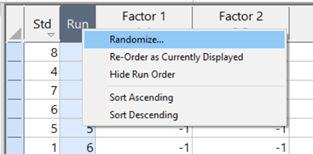
Figure 1: Right-click to Randomize
When Randomization Doesn’t Work
While randomization is ideal statistically, sometimes it is cumbersome in practice. For instance, temperature can take a very long time to change, so completely randomizing the runs may cause the experiment to go way beyond the time budget. In this case, researchers look for ways to reduce the complete randomization of the design.
I want to highlight a common DOE mistake. An incorrect way to restrict the randomization is to use blocks. Blocking is a statistical technique that groups the experimental runs to eliminate a potential source of variation from the data analysis. A common blocking factor is “day”, setting the block groups to eliminate day-to-day variation. Although this is a form of restricting randomization, if you block on an experimental factor like temperature, then statistically the block (temperature) effect will be removed from the analysis. Any interaction effect with that block will also be removed. The removal of this key effect very likely destroys the entire analysis! Blocking is not a useful method for restricting the randomization of a factor that is being studied in the experiment. For more information on why you would block, see “Blocking: Mowing the Grass in Your Experimental Backyard”.
If factor changes need to be restricted (not fully randomized), then building a split-plot design is the best way to go. A split-plot design takes into account the hard-to-change versus easy-to-change factors in a restricted randomization test plan. Perfect! The associated analysis properly assesses the differences in variation between these two groups of factors and provides the correct effect evaluation. The statistical analysis is a bit more complex, but good DOE software will handle it easily. Split-plot designs are a more complex topic, but commonly used in today’s experimental practices. Learn more about split-plot designs in this YouTube video: Split Plot Pros and Cons – Dealing with a Hard-to-Change Factor.
Wrapping up
Randomization is essential for valid and unbiased factor effect calculations, which is central to effective design of experiments analysis. It is up to the experimenter to ensure that the randomization of the experimental runs meets the DOE goals. Manual intervention may be required to separate any replicated points, such as center points. If complete randomization is not possible from a practical standpoint, build a split-plot design that statistically accounts for those restrictions.